Benefits Of A Single Page Website
Website design can be done in any number of ways. Whichever way you choose, it will have distinct pros and cons. In this article, we will examine single-page websites to help you determine if their pros and cons can fit your web design paradigm. For how they fare against a traditional web page structure, take a look at our Single Versus Multi-Page Websites article.
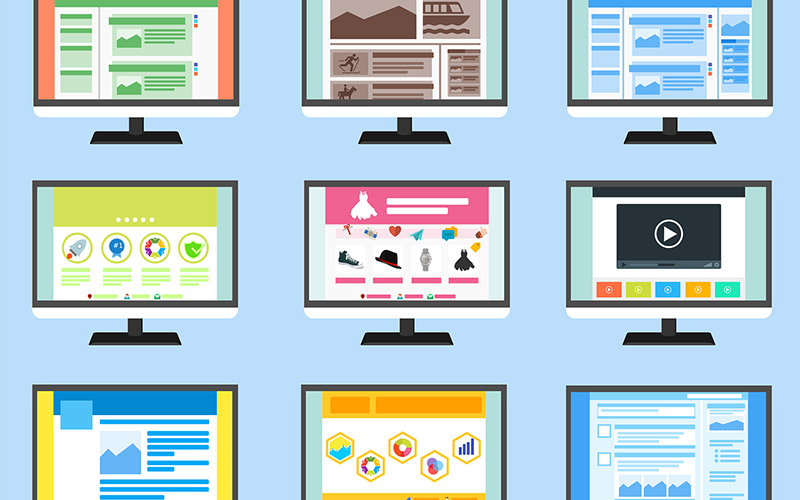
Table of Contents:
What Is A One-Page Website?
A one-page website is a dynamically loaded website that stitches together content so the user only has to go up and down through it. Compare that to a branching layout like that of Wikipedia, where each article leads to a dozen or a hundred other articles on or off Wikipedia.
The one-page layout doesn’t require multiple clicks but instead reacts in real time to the visitor’s scrolling to load or unload content on demand. This reduces the browser overhead and promotes better performance but also reduces mental fatigue. That’s why some of the most relaxing websites out there are one-page websites, as they feel inviting and enjoyable to use.
In comparison, the branching web page layout requires the visitor to constantly click the hyperlinks for each titbit of content that opens in a new tab or new window, burdening the browser and making it sluggish. Seeing how the human short-term memory is notoriously weak, a typical visitor gets lost in the tabs and windows and can hardly tell what’s where.
It’s not that you can’t design a good multi-page website. It’s just that it’s more complicated and more expensive. So let’s look at why you may want to consider a single-page website for your business.
10 Advantages Of A Single-Page Website
Higher engagement
The time a person spends on the website figures into that website’s digital authority ranking. The more you can keep a visitor occupied without using underhanded tricks, the more search engines will promote your website to the top of search results. High engagement time is also a reliable signal that the visitor might be interested in your other services.
Someone who wants to check Wikipedia for the Latin name of a cat types the query in the search engine, clicks the first result, gets the answer and bounces off. While providing an answer in 5–10 seconds is fine for a non-profit like Wikipedia, those numbers look poor when calculating the engagement metrics on a for-profit website.
A website that wants to generate revenue must have some way to not just attract a user but keep it engaged enough to stay. That’s the whole idea behind a single-page website, where the layout invites the reader to scroll on and find more content. By leveraging this powerful instinct of curiosity, you can engage with your users without them jumping through hoops to get more of your content.
Beware of putting too many barriers to inflate the engagement time, though. Search engines and users alike have become sophisticated enough to realize when they’re being gamed.

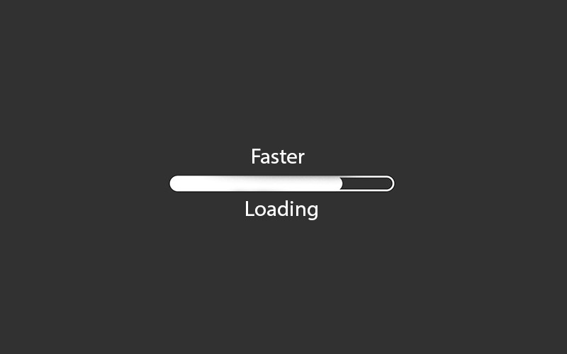
Faster Load Speeds
Loading speed makes a huge difference in how your website is perceived, especially on mobile devices. Anything between 0.4–2 seconds is acceptable; anything higher than that can make visitors think something is broken with your website. However, web design experts claim lower than 0.4 seconds can frighten the visitor and similarly ruin the engagement metrics.
Some websites unintentionally ruin their loading speeds by piling in images, fonts, JavaScript snippets, banners, ads and other elements that impact the loading time. Whenever possible, ensure your website acts and feels snappy since the average user is already distracted enough.
Thanks to the single-page layout, it’s much easier to test out the entire website at once and optimize the loading speeds as needed.
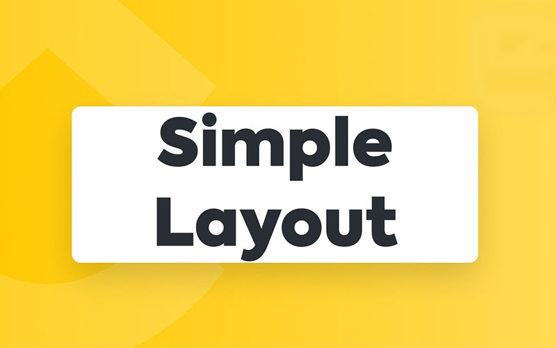
Simplified Layout
Simple, recognizable layout is what will make your website stand out, especially when the content is recorded and shared through unorthodox means. Think back to it — you can immediately recognize a Twitter comment just based on the layout of the elements. Thanks to the single-page website paradigm, you can easily tweak the layout of all your content to make it more memorable but also user-friendly.
Easy to Scale
Once you get the layout down pat, a one-page website is easy to scale to infinity without impacting performance or requiring revamps a few years down the line. The best part is that scaling up your website makes it more engaging, as the visitors want to explore all of it in a spontaneous way.

Easier Maintenance
A simple, unified layout is easy to maintain, no matter how large the website. Troubleshooting is much easier too, especially when dealing with niche software and hardware.
Cross-platform Compatibility
Because it promotes simplicity, a single-page application is more compatible across platforms, allowing users with unusual hardware or software to engage with your website. This again adds to your website’s engagement metrics.
Better SEO
Search engines don’t bother analysing web pages with titbits of content, which is why website owners feel obliged to put in tons of filler content. You can see this on recipe blogs, which are notorious for including quirky anecdotes just to have the recipe ranked in the search results. A multi-page website that wants to quickly rank high in search engine results must include hyper-optimized content instead of focusing on quality.
With a single-page website, the SEO of all individual pieces of content adds together, since it’s all on the same page anyway. That means you can take your time to create quality but can also stitch together a lot of low-effort content without having it tank your website’s search engine results ranking.
Cost-effective Branding
Branding is how you present yourself to a global audience. It most commonly involves placing your own logo, colours, fonts and other unique elements all over your content, like a non-intrusive watermark. As visitors browse your content, they ignore the branding but eventually wholeheartedly embrace it.
Branding is a necessary part of business growth but it is not cheap, with the largest portion of its cost going to long-term planning. If you can’t afford to create a long-term branding strategy right away, the single-page website structure will serve as a rough branding outline; all you have to do is fill in the blanks as you grow.
Keep in mind people grow accustomed to brands and don’t like them being radically changed.
Lower Bounce Rate
The percent of visitors that find one page on your website and quickly leave it is called “bounce rate”. A high bounce rate indicates to the search engine that the page is not a suitable destination for that particular search query, leading to it being bumped down the search results.
With multiple pages on a website, the bounce rate increases as visitors mistakenly click on a hyperlink in search for some piece of content or misinterpret poor navigation cues. With a single page, there is never any mistake and the bounce rate improves dramatically.
If you are considering a Multi page website, check out our guide on How many pages does my website need?
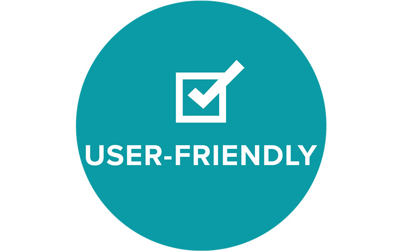
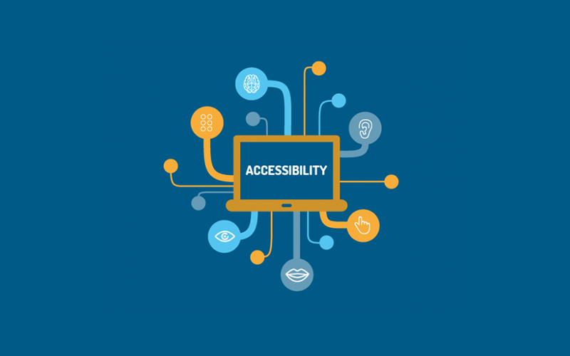
Greater Accessibility
Navigating hyperlinks is a mentally demanding task, especially in comparison with navigating a single page up or down. Hand-eye coordination or tapping a prohibitively small target on a smartphone screen are a challenge for people with disabilities and children. Adopting a simpler website structure means more visitors who can stay and engage with the content for longer.
The one-page layout allows the desktop visitor to use much easier navigation methods, such as:
- pressing Page Down/Up
- pressing Space/Shift+Space
- pressing the down/up arrow
These are universal across browsers and operating systems and have worked for decades. For smartphone users, long swipes allow them to skip over content they don’t want to see, providing more freedom at less energy expended.
3 Disadvantages Of a Single-Page website
Ineffective Back Button
The Back button is the cornerstone of modern web browsing. It allows the visitor to effectively undo whatever choice they’ve made on purpose or by accident, bringing them to the previous point. It is the most powerful tool for exerting control over the user’s journey through cyberspace. It’s no mistake smartphones have an embedded Back button in their design.
Sadly, the single-page paradigm takes away most of the power from the Back button. The visitor can no longer rely on the Back button taking him or her back to the last viewed piece of content. There is no simple solution for this problem, though you should try giving control to the user through various ways of bookmarking, highlighting or otherwise marking the content.
Inconsistent Reload Button
In a multi-page website layout, the user can go down the screen and press the reload button to refresh the content on the page, returning him or her to the same point. This is not how it works in single page applications, or rather, there is no way to guarantee a consistent behavior of the Reload button.
A single large web page where the position of content is determined dynamically will reload differently depending on how the code behind the page executes. It will most often leave the visitor in a random position, forcing more backtracking and causing confusion. There are workarounds for this problem, though none of them are elegant or simple.
Still Uses Clicks/Taps
In theory, desktop and smartphone users should be able to navigate websites using simple, repeatable commands that don’t require hand-eye coordination, such as pressing a button or doing wide swipes. In practice, they will still have to struggle with tiny clickable/tappable hyperlinks, banners and buttons, which reintroduces all the mess and frustration stemming from multi-page website layouts.
This is largely because social media sharing and commenting all use tiny embeddable buttons and banners that take the attention away from content.

Will A Single Page Website Work For Everyone?
No, but it has the biggest chance of working for the largest number of visitors at the lowest expense for the website owner. Single-page websites are the best we’ve got so far and they seem to tick all the boxes, fulfilling the needs of search engines, website owners and visitors.
Search engines only have to index a single page instead of content titbits; website owners can easily scale up and tweak their layout, boosting their engagement metrics; visitors can quickly access and navigate the content. The single page paradigm is also suitable for small businesses and large enterprises.
How To Create A Single-Page Website
A standard single page application is created in a few steps, though there are differences between them depending on your needs. For example, you might include a specific landing page for visitors coming from a certain traffic channel. You can also have a call to action that prompts the visitor to create an account or sign in before viewing the content.
In general, the single-page website design will go like this:
- define the budget for creation and maintenance;
- define the storytelling aspect, as in, who is the website for;
- pare down the brand message and the story until it’s easily conveyed;
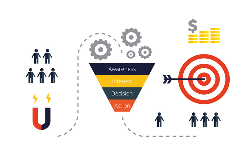
- plan a conversion funnel aka. how the website will monetize the traffic;
- ensure snappy loading speeds and optimize for mobile.
Quick and reliable iteration through these steps is key to making a successful single page application. You want to go through as many ideas as you can come up with, creating disposable mock-ups and rough layouts on the fly.
Find an experienced web design team to help you overcome obstacles and provide a spark of creativity. Test each design idea, note the ones that feel amazing and move on. After a dozen or a hundred iterations, you’ll have all sorts of cool concepts that aren’t enough on their own but combined make an “oh wow” impression on the user.
Remember that human psychology is equally obsessed with novelty and familiarity. You don’t want to reinvent the wheel but also not just chase trends. The ideal single-page website will be equal parts novel and familiar, enticing curiosity but also providing comfort to visitors from all walks of life. Use competitor websites to see what works on them and what needs tweaking.
Of course, once you do go through the design steps and create a workable website, you might want to include something that doesn’t seem to fit, like a product catalogue or a portfolio. You should resist the urge to tack on new ideas and sections as they dilute the benefits of the one-page website. Always go back to the same design process that worked in the past and iterate like there is no tomorrow.
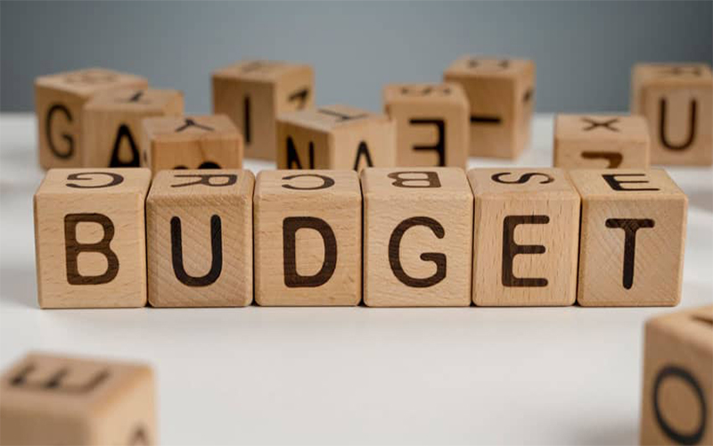
Define the Budget
Single page websites are optimized for quickly growing small businesses and start-ups, with the price to match. You can expect to pay $1500–3000 on a proper one-page site, with any remainder used towards marketing, lead generation and sales.
Websites can be made on a shoestring budget but they most often become victims of their success, which is the infamous “hug of death”. If a website is capable of handling 20,000 visitors a month but gets 20 million in a day, it will collapse under the traffic and become unavailable to all but the very first wave of users.
That’s why it’s important to plan for success from the start and include a conversion funnel, even in its humblest form, so the first visitors can provide a cash injection to the website owner. This cash can then immediately be put towards expanding the server capacity and receiving as many visitors while the hug of death still lasts.
Define the Story
Every website has a distinct story that is aimed at the kind of audience it wants to attract. This story can even be seen in the website’s brand name. For example, Facebook sports a lowercase brand name, indicating it’s a website for relaxed, casual connections. Of course, that’s how the brains behind Facebook define it now but it started as a hugely complex narrative that was streamlined until it fit into 8 letters.
Your goal is to determine your priorities and values and then find a way to convey them to your audience. When you’ve got it defined, your website should quickly become identifiable as “the website” for whatever purpose you gave it. In the case of Facebook, it is the website for casual communication with friends and family.
The fact you can give a Like to a Facebook user’s status but can’t indicate dislike means the website is designed to provide positive reinforcement, which is by definition addictive. The users get hooked to the jolts of satisfaction when someone likes their content and want to engage more with Facebook, sharing more and more with it, which increases its value and draws in more users. If you can find a similar way to hook in your users, they won’t be able to get enough of your website, automatically granting it a lot of digital authority, no matter the niche.
Pare Down the Brand Message
You’re bound to have many ideas swirling around in your head when you decide to make a single-page website. That’s perfectly fine, it’s just that one refined idea is worth much more than a dozen fuzzy ones. To turn a dozen ideas into one, you need experts to walk you through the design process and see what works for you and your audience.
If done properly, this will result in a naturally fitting font, colour combination, logo, layout and much more. You can even define your own icons, banners, social media buttons and whatever else you need. The rule of thumb is to keep things recognizable and in line with industry standards; the way it’s done in smartphone interfaces is the ideal way to do it on your website.
Plan a Conversion Funnel
When you make a fine product, people will throw money at you. Scratch that, they will shovel money at you. All you have to do is provide them with a way to do it and give them some consideration in return.
Will you offer a premium subscription for exclusive information and timely news? How about branded merchandise? Whatever you do, plan on including it straight away and don’t be ashamed of monetizing your website but don’t force it either.
As you build your core audience, a conversion funnel will let them finance you through the early stages of your business. Pay attention to your audience’s feedback and you’ll always have a backing that will tide you over any market crisis imaginable.
Ensure Snappy Loading Speeds
Finally, when you’ve got all the elements in place, it’s time to gel them and ensure your website is a worthwhile destination for the users. Test the performance across a range of software and hardware to catch bugs and glitches as soon as possible and ensure maximum compatibility.
Example Single-Page Website Layouts
If you are wondering exactly what a single-page website layout looks like, here two examples from our own client portfolio:
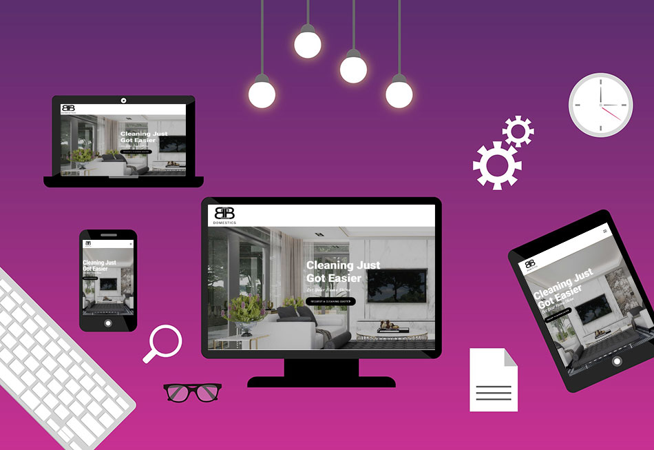
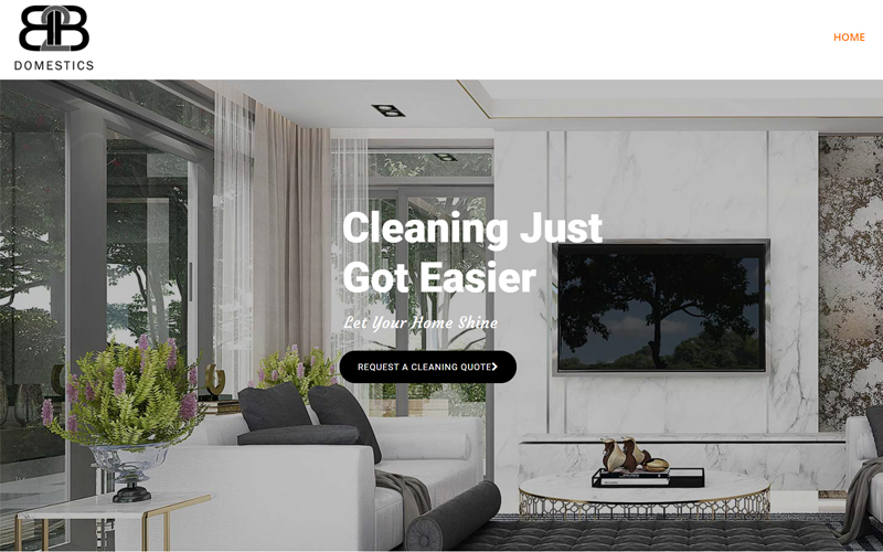
B2B Domestics
This site, built for a family-owned cleaning business is designed to highlight how B2B Cleaners stands out from the competition. We started with a large, full-stretch image to immediately put visitors in that “neat and tidy” state of mind. Calls-to-action are embedded throughout to increase conversions, and services are detailed in varying levels of detail to provide the customer just enough information to make hiring decisions easy.
View Website: www.b2bdomestics.com.au
Video Production Melbourne
For this video production company with 20 years of experience, we decided to quickly get into the vast variety of video types that the business can create. Utilizing a flip card element allowed us to fit a lot of information about each service into a small footprint so the user wouldn’t be scrolling forever or feel overwhelmed with information. We followed this section with a portfolio of past videos that transitions smoothly into an overview of what it’s like to work with Video Production Melbourne.
View Website: videoproductionmelbourne.com.au
Why Choose Our Starter Website Package For Your New Single-Page Site?
Masters of Digital is proud to offer our Starter Website Package, which is a sure-fire way to get a single-page website to your liking and to suit the needs of your audience. We will provide you with a design brief, and after you sign off on it, your website will be ready in 1–2 weeks for the budget-friendly starter price of $1,199.
It’s the perfect choice for a new business with a limited web design budget. You don’t have to sacrifice quality to get a website you can afford.
Get A Free Website Design Quote
Considering a new Website? Complete the below form to discuss your project and get a free quote from your local Australian website designer.